Fall Photo Sessions - How to Coordinate Outfits
- rachaelbaileyphoto
- Oct 28, 2022
- 2 min read
Hot apple cider, flannels, pumpkins, and the many colored leaves...
...are some of the first things people think of during Fall. There's a warmer, more welcoming aesthetic to Autumn that makes people feel comfy. During photo sessions, there's an underlying focus to maintain those cozy feelings within the images. A way to do that is coordinating outfit colors to mesh well with the backdrop/background. There are a few different color themes that work well with the classic Autumn colors. Continue reading to learn more!
The Color Schemes
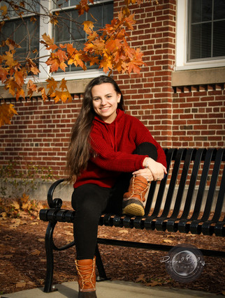
Fall in New England is famously known for its bright and warm colors -- which means one way in order to stand out against them is to wear more neutral and earthy colors, but with a warmer and softer undertone.
The classic neutrals are:
Beige
Ivory
Mocha
Blues/Greens with a "comfy shade" (think steel blue or an olive green)
This color scheme allow for you and your loved ones to not blend into the background, but not stick out in too harsh of a way. (A secret to these kinds of colors is they work well during any time of the year, too).


Jewel tones are another example of more natural colors, but they have a richer energy to them. Colors such as:
Burgundy
Plums
Golds
Blues/Greens with a "thick and cozy shade" (think royal blue or emerald)
Coordinating these colors is fairly easy, however, you don't want to over-do it and try to include all of them. These kinds of colors can work for late Fall photos as the leaves have started to fall off the trees and there may or may not be snow on the ground.


The Patterns
Patterns are a super fun way to add something a little extra to your outfits that really show your family as a whole unit. They can be used strategically to make your eyes go to the subject (you and your family) and not get too distracted by what's going on in the background. Patterns with lines, stripes, or textures that help guide your eyes up and to the center are most idea for Fall photo sessions. For example:
Plaids
Checkers
Corduroy
Wool or knitted/crocheted patterns in sweaters
Each of those patterns/textures have elements within them that help lead your eyes to where the focus is. The trick is to layer them with solid colors within the same color family as having too many will be distracting and your images will look busy and muddled. Matching everyone's outfits too similarly will have the opposite effect you're going for and take away from the photos.


I hope this post helps you get a better idea on how to pick out what to wear for your Fall photos! Remember, don't go crazy in one color or try to add too many elements. Have each person have their own style, but in similar colors to the rest of the group (the same can apply to just two people).
Want more to read? Check out these other blog posts/articles!
Kelly Harris - Sept 30, 2022
Shutterfly Community - Oct 21, 2022
Clair Murthy - 2022


Comments